I previous posts I have already introduced seaborn and matplotlib.pyplot for visualization in Python. In this post I want to introduce the altair module. This is an alternative module supporting visualization in Python.
The altair module can be installed with pip install via the command prompt.
Below I import the altair module along with pandas and pandas_datareader. I will use pandas_datareader to read in stock price data for Tesla. I will visualize the stock price development with a chart created in altair. But first I query the data from Yahoo Finance and display the header of the dataframe retrieved:
# import relevant modules
import pandas as pd
import altair as alt
import pandas_datareader.data as web
import datetime
# read in stock price data for tesla for the last 5 years
start = datetime.datetime(2015,10,11)
end = datetime.datetime(2020,10,11)
df = web.DataReader("TSLA","yahoo",start,end)
# display header of stock price data frame
df.head()
| High | Low | Open | Close | Volume | Adj Close | |
|---|---|---|---|---|---|---|
| Date | ||||||
| 2015-10-12 | 44.599998 | 43.054001 | 44.598000 | 43.116001 | 19181500.0 | 43.116001 |
| 2015-10-13 | 44.504002 | 42.226002 | 42.655998 | 43.849998 | 25857500.0 | 43.849998 |
| 2015-10-14 | 44.189999 | 43.085999 | 44.133999 | 43.375999 | 15522000.0 | 43.375999 |
| 2015-10-15 | 44.346001 | 42.740002 | 43.285999 | 44.262001 | 14221000.0 | 44.262001 |
| 2015-10-16 | 46.096001 | 44.574001 | 44.608002 | 45.402000 | 21672500.0 | 45.402000 |
Currently the dates are row indices of the data frame. For working with altair its better to add them as a separate column with a specified column header:
df["Dates"] = df.index
Now that I have my data I can create a stock price chart with the altair module in Python:
# create chart with altair
chart = alt.Chart(df).mark_area().encode(
    x="Dates",
    y="Close"
)
# display altair chart
chart
That was a very basic chart. Below I create another area chart, with a color gradient:
# create altair chart
chart = alt.Chart(df).mark_area(line={'color':'darkgreen'},color=alt.Gradient(
        gradient='linear',
        stops=[alt.GradientStop(color='white', offset=0),
               alt.GradientStop(color='darkgreen', offset=1)])).encode(x="Dates",y="Close")
# display altair chart
chart

I want to add a title to the chart. I also want to change the x- and y-axis titles. I do so in the code below:
# add chart title
chart.title = "Daily TSLA stock closing prices [USD]"
# adjust x and y axis labels
chart.encoding.x.title = "Time"
chart.encoding.y.title = "Daily closing price [USD]"
# display modified chart
chart

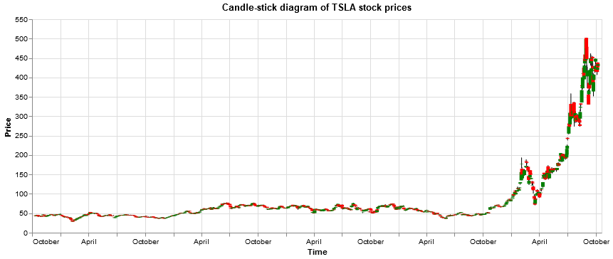
Now lets try to make a candle-stick diagram. An explanation of stock analysis with candle-stick diagrams can e.g. be found here: https://diagrammm.com/candlestick_chart
# create color conditions
color_conditions = alt.condition("datum.Open <= datum.Close",
                                 alt.value("green"),
                                 alt.value("red"))# build chart
chart = alt.Chart(df).encode(x = "Dates")
# set title of chart
chart.title = "Candle-stick diagram of TSLA stock prices"
# set x axis label for chart
chart.encoding.x.title = "Time"
# construct a rule mark using mark_rule() method
rules = chart.mark_rule().encode(
    y = "Low",
    y2 = "High")
# adjust y axis label for rules
rules.encoding.y.title = "Price"
# construct bars
bars = chart.mark_bar().encode(
    y="Open",
    y2="Close",
    color = color_conditions)
# display rules and bars (both based on the same basic chart
rules + bars

In above candle-stick diagram altair bars have been placed as a second layer on top of altair rules.
Let us create some more plotting examples, using the stock price data for Tesla. In below code I create a stock price line plot for Tesla daily stock closing prices:
# create line plot
chart = alt.Chart(df).mark_line().encode(x="Dates",y="Close")
# set title and axis lables
chart.title = "Daily TSLA stock closing prices"
chart.encoding.x.title = "Time"
chart.encoding.y.title = "Price [USD]"
# display line plot
chart

When creating a chart I can also specify some additional properties such as e.g. the width of the chart:
# create color conditions
color_conditions = alt.condition("datum.Open <= datum.Close",
                                 alt.value("green"),
                                 alt.value("red"))# build chart
chart = alt.Chart(df).encode(x = "Dates").properties(width=800)
# set title of chart
chart.title = "Candle-stick diagram of TSLA stock prices"
# set x axis label for chart
chart.encoding.x.title = "Time"
# construct a rule mark using mark_rule() method
rules = chart.mark_rule().encode(
    y = "Low",
    y2 = "High")
# adjust y axis label for rules
rules.encoding.y.title = "Price"
# construct bars
bars = chart.mark_bar().encode(
    y="Open",
    y2="Close",
    color = color_conditions)
# display rules and bars (both based on the same basic chart
rules + bars

This completes my basic introduction to the altair module in Python. For more information I e.g. recommend checking the documentation: https://altair-viz.github.io/
You can also check my other posts on visualization in Python and R, covering e.g. spatial data visualization with Leaflet in R, geocoding and heatmapping with Folium and Leaflet in Python and 3D heatmapping with deckgl in R. I also wrote several tutorials on data visualization with Seaborn and Matplotlib.pyplot in Python. I e.g. used Matplotlib for visualizing the efficient frontier of trucking stocks by applying Markowitz portfolio theory in combination with monte-carlo simulations.

Data scientist focusing on simulation, optimization and modeling in R, SQL, VBA and Python


Leave a Reply