In previous posts I have querried and visualized data related to US automotive industry, using public data provided by e.g. the Federal Reserve or the US bureau of labor statistics.
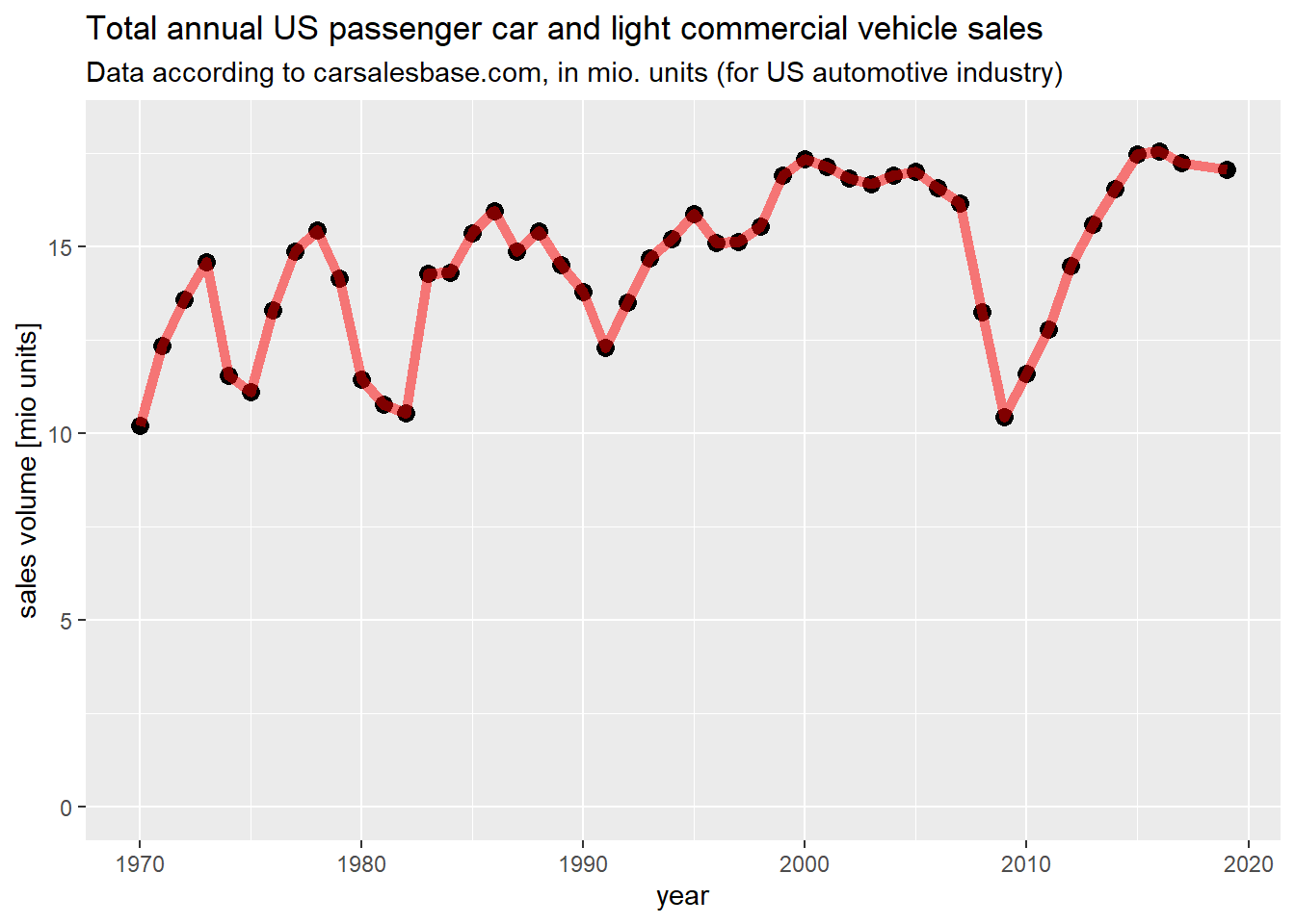
As a further reference, I wanted to plot a graph on total US passenger car and light commercial vehicle sales, according to calsalesbase.com
The data has been copied from here: http://carsalesbase.com/us-car-sales-data/
Using my other posts, it can be cross-validated.
data_df = read.csv2("passenger cars and light commercial vehicles.csv",
                    header=TRUE,
                    stringsAsFactors = FALSE,
                    sep=",")

library(ggplot2)
ggplot(data_df) + geom_point(aes(x=year,y=sales/1000000),color="black",size=3) + geom_path(aes(x=year,y=sales/1000000),color="red",size=2,alpha=0.5) +
  labs(title="Total annual US passenger car and light commercial vehicle sales",
       subtitle="Data according to carsalesbase.com, in mio. units (for US automotive industry)") +
  xlab("year")+
  ylab("sales volume [mio units]")+
  ylim(0,18)

Data scientist focusing on simulation, optimization and modeling in R, SQL, VBA and Python


Leave a Reply