In a previous post I explained CAGR-based forecasting. CAGR-based forecasting is a very simple forecasting method which is often applied in industry, e.g. for forecasting sales and production output.
Simple forecasting models have benefits. They are easy to understand and easy to implement. In addition, they contain few parameters and are thus very precise in their core assumptions. In this way it can be said that simple forecasting methods are in many cases the best forecasting methods. In other words: If you try to predict the future you might as well want to do it with a forecasting model that you understand fully and that you could explain to anyone anytime.
In this post I would like to introduce time series forecasting based on a simple moving average calculation. Moving averages, also referred to as rolling averages or rolling means, are used for analyzing and pre-processing historic time series data. Nevertheless, they can be used for creating a simple forecasting algorithm.
I distinguish simple moving average forecasting into two categories:
(a) forecasting from historic data by calculting a rolling average
(b) same as (a), but with an additional intrinsic growth parameter
Category (b) is thus a combination of CAGR-based forecasting and rolling average forecasting.
Like CAGR-based forecasting simple rolling average forecasting ccan only be used for limit time horizons.
I implement such a forecasting approach in the coding example below, using a function that calculates a moving average of defined length. I implement this function in R, and apply it for forecasting future values. I call the function “sma_forecast”. It is implemented in the R code below:
# a function for predicting future values of a time series, based on a simple moving average
# parameter "length" determines amount of time into the future predicted
# parameter "past" is a vector with all initial historic values; moving average will start as the mean over all of these values
sma_forecast = function(past,length){
  # create a empty vector of desired "length"
  future = rep(0,times = length)

  # connect past and future into one vector
  prediction = c(past,future)

  # iterate through prediction vector and populate the missing values
  for(i in (length(past)+1):length(prediction)){
    prediction[i] = mean(prediction[(i-length(past)):(i-1)])
  }

  # return the prediction as the final result
  return(prediction)
}
The next step in this workflow is to read in historical data. In this case I read in data on annual production output for automotive industry by coutry, measured in number of units produced in a given year within a given country. The last step is to calculate the forecast, using the sma_forecast. All of this is done in the coding example below, using R:
# read in readxl
library(readxl)'
# read in data
data_df = as.data.frame(read_xls("oica.xls"))
# view header
head(data_df)
## year country total
## 1 2018 Argentina 466649
## 2 2018 Austria 164900
## 3 2018 Belgium 308493
## 4 2018 Brazil 2879809
## 5 2018 Canada 2020840
## 6 2018 China 27809196# view tail
tail(data_df)## year country total
## 835 1999 Turkey 297862
## 836 1999 Ukraine 1918
## 837 1999 UK 1973519
## 838 1999 USA 13024978
## 839 1999 Uzbekistan 44433
## 840 1999 Others 11965# filter out USA, using dplyr
library(dplyr)
data_df = filter(data_df,country=="USA")
# plot time series, using ggplot2 in R
library(ggplot2)
ggplot(data_df) +
geom_path(mapping = aes(x = year, y = total/1000000),
size = 2,
color = "red") +
labs(title = "US automotive industry production output",
subtitle = "historical OICA data, for 1999 - 2018") +
xlab("year") +
ylab("output [millions of units]") +
ylim(0,15)
# create new data frame with the historical data and the predictions; make it ggplot2 friendly
# -- re-arrange old data_df
library(dplyr)
data_df = data_df %>% arrange(desc(-year))
# -- use the sma_forecast function to calculate a forecast, based on simple moving average
predictionVals = sma_forecast(past=data_df$total,length = 10)
# -- create new empty dataframe
plot_df = as.data.frame(matrix(nrow=length(predictionVals),ncol= 4))
colnames(plot_df) = c("year","country","total","category")
plot_df$total = predictionVals
plot_df$category[1:nrow(data_df)] = "history"
plot_df$category[(nrow(data_df)+1):length(predictionVals)] = "prediction"
plot_df$year = data_df$year[1]:(data_df$year[1]+length(predictionVals)-1)
plot_df$country = data_df$country[1]
# -- plot the content of the dataframe, using gpgplot2
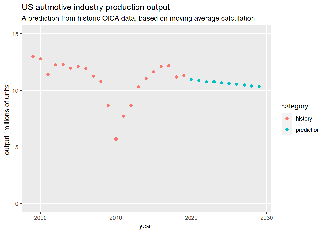
ggplot(plot_df) +
  geom_point(mapping = aes(x = year,
                          y = total/1000000,
                          color = category),
             size = 2) +
  labs(title = "US autmotive industry production output",
       subtitle = "A prediction from historic OICA data, based on moving average calculation") +
  xlab("year") +
  ylab("output [millions of units]") +
  ylim(0,15)
I end my example at this point.
Things I could have added:
(a) Splitting in training and test set to evaluate methode
(b) Evaluate method for various countries, time intervals and predictions lengths
(c) Test prediction on data different from production output data
(d) …
If you found this post interesting you can consider checking out my other posts, on e.g. CAGR-based forecasting, obtaining and analyzing OICA data, time series analysis, linear programming, public sources for automotive industry sales data, etc.

Data scientist focusing on simulation, optimization and modeling in R, SQL, VBA and Python


Leave a Reply