In this article I will create map-based charts in R, using the leaflet.minicharts package in R. I already introduced Leaflet for creating markers on maps and for visualizing spatial distributions with density heatmaps. In this blog post I create barcharts, piecharts and polar area charts using leaflet.minicharts in R.
Creating a basemap with Leaflet in R
First, I create a basemap for my visualization. I can do so using the Leaflet package in R. In the lines of code below I create the basemap.
library(knitr)
library(leaflet)

basemap = leaflet() %>%
  addTiles() %>%
  addProviderTiles(providers$OpenStreetMap.DE) %>%
  setView(-98,38.5,zoom=4)

basemap
In this case I want to visualize data for USA. For this reason I set the map view to display most of the US states. Hawaii is not shown.
Importing in sales data for leaflet.minicharts
Next, I import sales data for each relevant US state. The data has already been prepared and summarized in Excel. This is why the data is available in a csv-file that I import into memory.
data = read.csv("sales.csv",header=TRUE)
head(data)
## state longitude latitude sales_sensors sales_pumps sales_displays
## 1 Wisconsin -89.50000 44.50000 13000 12002.374 5664.6262
## 2 West Virginia -80.50000 39.00000 5000 2739.885 3774.7759
## 3 Vermont -72.70000 44.00000 3400 1041.972 2332.2328
## 4 Texas -100.00000 31.00000 37000 6287.578 13425.8577
## 5 South Dakota -100.00000 44.50000 5600 3115.934 558.0957
## 6 Rhode Island -71.74233 41.74233 4000 3623.527 873.5025
## sales_motoroil sales_filters sales_tires sales_headlamps sales_rearlighting
## 1 10646.1263 3962.7175 4863.633 1921.3345 3692.084
## 2 844.2269 524.2226 4728.812 425.4734 2107.706
## 3 640.9263 1003.8087 2410.252 3056.3377 2659.093
## 4 16161.9943 30441.3494 10438.494 2196.3884 35905.807
## 5 5338.5218 4551.7116 3200.116 3823.2335 3946.851
## 6 1758.7899 3633.4848 3170.961 3211.9275 2669.132
## sales_interiorlighting sales_total
## 1 11227.7133 66980.61
## 2 956.6307 21101.73
## 3 3177.5397 19722.16
## 4 6316.8175 158174.29
## 5 723.8857 30858.35
## 6 3967.7682 26909.09The dataset summarizes sales revenue from last fiscal year for a automotive sparepart retail business. The retailer specializes on the European car park and currently ships all its sales orders to customers by dropshipping from Germany, France, Italy, and Spain. Sales is categorized into major product groups.
Visualizing sales data using leaflet.minichart
To begin with I create a bar chart map using Leaflet and leaflet.minichart. I use the bar charts to compare sales of pumps and sensors across USA.
library(leaflet.minicharts)
library(magrittr)
library(dplyr)

colors = c("#FF0000", "#428EF4")

basemap %>%
  addMinicharts(
    data$longitude, data$latitude,
    chartdata = select(data,sales_sensors,sales_pumps),
    colorPalette = colors,
    width = 45, height = 45
  )
How does this compare to total sales? Below bar chart map delivers the answer to this question.
colors = c("#FF0000", "#428EF4","black")

basemap %>%
  addMinicharts(
    data$longitude, data$latitude,
    chartdata = select(data,sales_sensors,sales_pumps, sales_total),
    colorPalette = colors,
    width = 45, height = 45
  )
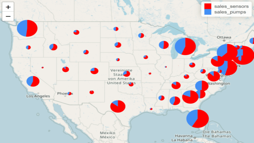
I can make an overview like this using pie charts as well. See below code:
colors <- c("#FF0000", "#428EF4")

basemap %>%
  addMinicharts(
    data$longitude, data$latitude,
    type = "pie",
    chartdata = select(data,sales_sensors,sales_pumps),
    colorPalette = colors,
    width = 60 * sqrt(data$sales_total) / sqrt(max(data$sales_total)), transitionTime = 0
  )
Pie size is defined by the circle radius. It results from total sales revenue across all product categories. I now generate one more map that displays pie charts with all product categories.
basemap %>%
  addMinicharts(
    data$longitude, data$latitude,
    type = "pie",
    chartdata = select(data,sales_sensors,sales_pumps,sales_displays,sales_motoroil,sales_filters,sales_tires,sales_headlamps,sales_rearlighting,sales_interiorlighting),
    width = 60 * sqrt(data$sales_total) / sqrt(max(data$sales_total)), transitionTime = 0
  )
By generating visualizations like this I help the retailer understand the US market from a distribution logistics point of view.
Other chart types with leaflet.minicharts
Using leaflet.minicharts I can also show material flows as directional flows on the map. For this I need to construct a dataframe that contrains “source” and “sink” coordinates in the form of latitude and longitude values. In addition, flow volume must be quantified in the dataframe to plot.
Last, but not least, I can also use leaflet.minicharts to create animated charts. This is e.g. helpful when showing some time-based trend on a map.
Summary of this leaflet.minicharts post
In this article I introduced leaflet.minicharts as a package in R for map-based chart plotting. In previous articles I had introduced Leaflet for e.g. marker plots or map-based heatmaps. This article documented how leaflet.minicharts can be used to add e.g. bar charts and pie charts to a Leaflet map.
Related content on this blog
If you are interested in spatial data visualization I recommend that you have a look at some other related articles:
- Link: deckgl in R for spatial data visualisation
- Link: Geocoding spatial data with tidygeocoder in R
- Link: Spatial SCM data visualisation in R
- Link: Spatial heatmaps in Python using Leaflet.js via Folium module
- Link: Leaflet heatmaps in R
- Link: Map-based scatterplots with deckgl in R
- Link: Single warehouse problem locating warehouse at center-of-mass using R
- Link: Free tools for spatial data visualization

Data scientist focusing on simulation, optimization and modeling in R, SQL, VBA and Python


Leave a Reply