In previous posts I have analyzed sales and production output data related to German and US automotive industry, provided by sources such as US Federal Reserve, Carsalesbase.com and German VDA (lobby for German automotive industry). For this, see e.g. my previous posts titled as follows:
- VDA time series data on German automotive industry, analyzed in R
- Time series of hourly earnings in US automotive industry, analyzed in R
- Plotting carsalesbase total annual US vehicle sales data (using R)
- Applying fredr package in R: Analyzing FRED domestic car production data for USA
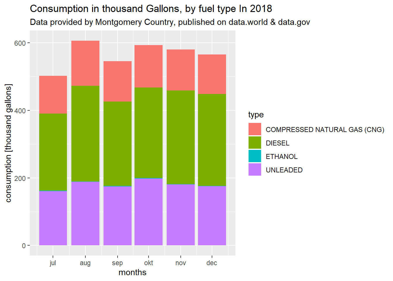
Now I found a data set containing time series data on vehicle type fuel consumption, provided by Montgomery County. The data can be downloaded here: https://data.world/montgomery-county-of-maryland/5fa8def2-37b9-4abe-88d7-c60726429982 or https://catalog.data.gov/dataset/fleet-fuel-consumption
The data gives insights into fuel type market share development in 2018, in Montegomery Country.
In below R code I read in the csv-file downloaded from that side. I proceed by displaying the header of the data frame:
data_df = read.csv2("fuel consumption.csv",header=TRUE,sep=",",dec=".")
head(data_df)
## Report.Month.Year Fuel.Type Fuel.Quantity..In.Gallons.
## 1 10/01/2018 ETHANOL 1711.06
## 2 12/01/2018 DIESEL 271875.40
## 3 12/01/2018 UNLEADED 175248.62
## 4 11/01/2018 DIESEL 276922.46
## 5 11/01/2018 ETHANOL 1192.99
## 6 12/01/2018 COMPRESSED NATURAL GAS (CNG) 117017.11I want to plot this data with ggplot2 in R. For this I convert the date entries into date format. Afterwards I produce a plot using the ggplot2 package in R.
colnames(data_df) = c("month","type","consumption")
data_df$month = as.Date(data_df$month,"%m/%d/%Y")
library(ggplot2)
ggplot(data_df) + geom_col(mapping=aes(x=month,y=consumption/1000,fill=type)) +
  labs(title="Consumption in thousand Gallons, by fuel type In 2018",
       subtitle="Data provided by Montgomery Country, published on data.world & data.gov") +
  xlab("months") +
  ylab("consumption [thousand gallons]")
According to data.gov the data has been collected based on fuel transactions.

Data scientist focusing on simulation, optimization and modeling in R, SQL, VBA and Python


Leave a Reply