Julia includes many packages that could be used in operation research and optimization in general. This article serves as a brief introduction to different packages available in Julia’s ecosystem. I will focus on two packages that are stepping-stones in future work: DataFrames.jl and PyPlots. DataFrames.jl provides a set of tools for working with tabular data similar to Pandas in Python. The PyPlots module provides a Julia interface to the Matplotlib plotting library from Python. Although PyPlots is a distribution of Python and matplotlib, Julia can install a private distribution that can’t be accessed outside Julia’s environment.
Adding the necessary packages
Open a new terminal window and run Julia. Use the code below to add the packages required for this article.
julia> using Pkg
julia> Pkg.add("DataFrames")
julia> Pkg.add("CSV")
julia> Pkg.add("Arrow")
Open a new terminal window and run Julia. Initialize the PYTHON environment variable:
julia> ENV["PYTHON"] = ""
""
Install PyPlot:
julia> using Pkg
julia> Pkg.add("PyPlot")
After adding all the required packages using Julia REPL, the following code is used to import the packages in the Jupyter editor (i.e. Jupyter Notebook).
using DataFrames
using CSV
using Arrow
using PyPlot
Using DataFrames in Julia

DataFrames requires some packages in the backend like CSV and Arrow to complete its operations properly. Thus, these packages were added initially in the section before.
Using PyPlots in Julia

Because PyPlots is an interface for matplotlib in Julia, all the documentation is available on matplotlib’s main page.
Covid-19 showcase using Julia
The first covid-19 case was detected on the 17th of November, 2019. Although two years passed since the pandemic started, the virus is still persisting and cases are increasing exponentially. Thus, data analysis is important to understand the growth of cases around the world. I will be using a .csv file containing data about the cases in country X. The file is available in a public repository on my GitHub page, so I can copy it to an excel sheet and move it to the directory file where the Jupyter notebook is located. Also, I can import the data from the web using excel and attach the link of the raw format of the database on GitHub. In both cases, saving the file as time.csv is necessary to fit with the code in later stages.
Here, I am showing the database, in csv format, that I opened via excel on my desktop.

I will read the csv file, in the Jupyter notebook, using the code block below:
df  = CSV.File("time.csv") |> DataFrame; # reading the csv file using CSV package and changing it to a DataFrame using the arrow operation |>
df[1:5,:] # output the first five rows
Importing data files is smoother using DataFrames. Some of the operations present in the code blocks below are explained in a previous post introducing Julia. Plotting is another important tool to understand data and visualize it better. Matplotlib is introduced before to the blog but in Python.
The code block below creates a bar chart showing the number of cumulative tests and cumulative negative cases over a period of six days from the DataFrame, df, imported above.
y1 = df[20:25,2];
y2 = df[20:25,3];
x = df[20:25,1];

fig = plt.figure()
ax = plt.subplot()
ax.bar(x, y1, label="cumulative tests",color="black")
ax.bar(x, y2, label="cumulative negative cases",color="grey")
ax.set_title("Covid-19 data in Country X",fontsize=18,color="green")
ax.set_xlabel("date",fontsize=14,color="red")
ax.set_ylabel("number of cases",fontsize=14,color="red")
ax.legend(fontsize=10)
ax.grid(b=1,color="blue",alpha=0.1)
plt.show()
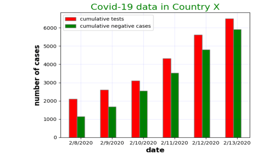
The bar chart above could be improved by allocating a bar for each category. This is done using the code block below.
barWidth = 0.25
br1 = 1:1:length(x)
br2 = [x + barWidth for x in br1]

fig = plt.figure()
ax = plt.subplot()
ax.bar(br1, y1,color="r", width=barWidth, edgecolor ="grey",label="cumulative tests")
ax.bar(br2, y2,color ="g",width=barWidth, edgecolor ="grey", label="cumulative negative cases")
ax.set_title("Covid-19 data in Country X",fontsize=18,color="green")
ax.set_xlabel("date", fontweight ="bold",fontsize=14)
ax.set_ylabel("number of cases", fontweight ="bold",fontsize=14)
ax.legend(fontsize=10)
ax.grid(b=1,color="blue",alpha=0.1)
plt.xticks([r + barWidth for r in br1],  ["2/8/2020", "2/9/2020", "2/10/2020", "2/11/2020", "2/12/2020","2/13/2020"])
plt.legend()
plt.show()
Understanding the exponential growth associated with covid19 requires plotting the whole dataset which is over the span of 44 days. Therefore, the next code block aims to show the covid cases of the complete dataset.
days = 1:1:44
days_array = collect(days)
confirmed_cases = df[:,4]

fig = plt.figure(figsize=(10,10))
ax = plt.subplot()
ax.bar(days_array,confirmed_cases , color ="blue",width = 0.4)
ax.set_title("A bar chart showing cumulative confirmed covid-19 cases in country X",fontsize=22,color="darkgreen")
ax.set_xlabel("day number",fontsize=16,color="darkgreen")
ax.set_ylabel("number of cases",fontsize=16,color="darkgreen")
ax.xaxis.set_ticks_position("none")
ax.yaxis.set_ticks_position("none")
ax.xaxis.set_tick_params(pad = 5)
ax.yaxis.set_tick_params(pad = 10)
ax.grid(b = 1, color ="grey",linestyle ="-.", linewidth = 0.5,alpha = 0.2)
fig.text(0.3, 0.8, "SCDA-JaafarBallout", fontsize = 10,color ="grey", ha ="right", va ="bottom",alpha = 0.6)
plt.show()
Even though bar charts are powerful in our case, it is still nice to observe the exponential curve. For that, a code block is presented below to plot the growth curve of confirmed cases.
fig = plt.figure(figsize=(10,10))
ax = plt.subplot()
ax.plot(days_array,confirmed_cases , color ="blue",marker="o",markersize=6, linewidth=2, linestyle ="--")
ax.set_title("A bar chart showing cumulative confirmed covid-19 cases in country X",fontsize=22,color="darkgreen")
ax.set_xlabel("day number",fontsize=16,color="darkgreen")
ax.set_ylabel("number of cases",fontsize=16,color="darkgreen")
ax.grid(b = 1, color ="grey",linestyle ="-.", linewidth = 0.5,alpha = 0.2)
fig.text(0.3, 0.8, "SCDA-JaafarBallout", fontsize = 10,color ="grey", ha ="right", va ="bottom",alpha = 0.6)
plt.xticks(size=16, color ="black")
plt.yticks(size=16, color ="black")
plt.show()
Realizing a meme! (with Julia)

Recently, this meme got viral. So, it is nice to figure the missing functions by plotting.
fig, axs = plt.subplots(2, 2);
fig.tight_layout(pad=4);

x1 = range(-10, 10, length=1000);
y1 = range(1, 1,length =1000);

axs[1].plot(x1, y1, color="blue", linewidth=2.0, linestyle="-");
axs[1].set_xlabel("x1");
axs[1].set_ylabel("y1");
axs[1].set_title("Constant");

x2 = range(-10, 10, length=1000);
y2 = x2.^3;

axs[2].plot(x2, y2, color="blue", linewidth=2.0, linestyle="-");
axs[2].set_xlabel("x2");
axs[2].set_ylabel("y2");
axs[2].set_title("Y = X^(3)");

x3 = range(-10, 10, length=1000);
y3 = x2.^2;

axs[3].plot(x3, y3, color="blue", linewidth=2.0, linestyle="-");
axs[3].set_xlabel("x3");
axs[3].set_ylabel("y3");
axs[3].set_title("Y = X^(2)");

x4 = range(-5, 5, length=1000);
y4 = cos.(x4);

axs[4].plot(x4, y4, color="blue", linewidth=2.0, linestyle="-");
axs[4].set_xlabel("x4");
axs[4].set_ylabel("y4");
axs[4].set_title("Y = cos(X)");
Graphing networks by hand or traditional software seems exhausting. In future posts, I will demonstrate how to draw complicated networks using Julia and its dependencies. Then, I will solve the network problem using the JuMP package.

A chemical engineer interested in optimization and using open-source software to empower research and academia!


Leave a Reply